15. Rochelle Laurencin, Anil Berisha, Alex Fluin from 283goswell on Vimeo.
Showing posts with label Rochelle Laurencin. Show all posts
Showing posts with label Rochelle Laurencin. Show all posts
Friday, 24 May 2013

Thursday, 31 January 2013
Question 4 - What have you learned from your audience feedback?
NB: I feel that the audience feedback was only surrounded by our core audience (teenage girls). As a result, I am aware that I should have got more male feedback, because I would of been able to get their perspective on it and how the artist was represented to them. This would allow me to see whether we have successfully challenged the male gaze theory.
Friday, 18 January 2013
Wednesday, 16 January 2013


PRODUCTION: Editing Outside panel Gaussian Blur
I used the Guassin blur on the back image of the outside panel because I was told that the two images were to strong and there was no contrast, therefore Gaussian Blur the whole entire image.


Then I can change the pixel to make it extremely blurry or lightly blurry.
Tuesday, 15 January 2013
PRODUCTION: Editing Advert - distoring background

How I changed the background of my advert.
I had to add an effect to the background of my original image because I had edited out a sign that spoiled the image and made it look unprofessional.


 I then clicked on the select tab where I then changed the settings of the quick selection and changed it to inverse select by doing this it changed where I wanted to selceted and chose the background instead.

Here is an example of what effects can be added onto the background.

I selected this effect simply because of the issue that happened with the clone tool. As once I edited the sign that was in the background. For that I had to use the clone tool, to take the clone of the original image for that area. Therefore, by using this effect where I had edited the sign is not as obvious


Here is the advert!!!
PRODUCTION: Editing digipak - inside panel

How I created the magical effect in the inside panel.

 Here is my original image of the forest. I imported the CD template on to my inside panel. The reason why I done this, is because I wanted the CD to have the same pattern as the inside panel. I wanted the CD to have an exciting visual, which a normal convention in a digipak design. I was inspired by Kate digipak because I really like it and adds to continuity.
I chose to use brush tool 3 just so it acts a fine outline over the branches to create an effect that it has magical and delicately been placed on top of the branches all to do with her music presence.
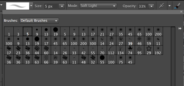


 I decided that a want the light to weave in and out of the tress. So changed the brush tool to number 134 to create a grass effect. I then clicked on the tab filter gallery to change the colour effect of the grass. I choose to use an neon yellow to add to the colour effect to demonstrate a light weaving through the trees.

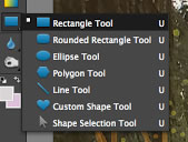
To create the goldie - orange misty effect. It was quite simple to do. First, I had to select the shape tool. I
 then clicked on rectangle shape, so I can include the whole of the inside panel. I then clicked on the fill tool and used the pippet to get the same shade of font colour used on Journey.
I then changed the opacity of the shape fill. Changing the opacity allowed me to fade the colour so it didn't dominate the entire image and we still get to see the forest imagery. I settled at 45%


 To create the same fuzzball effect shown on the front cover I used the same paint brush tool and dotted the fuzzball to make it follow the goldie - orange light.
There we have it, how I created the a "glowy", magical forest just by using the tools offered on Photoshop (I enjoyed making the inside panel even though I had several doubts whether it was going to work or not it came out great after I finished it. I am really proud on how it came out).
PRODUCTION: Editing digipack - creating the Shining light
When creating the shining light on the front it was not as easy as I thought it was going to be. I had to do so many changes to make sure I can get the perfect image of the light. I had to come up with so many ideas and here I have found the most perfect amazing solution, for it.
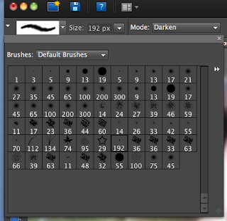 For me to create my inspired light I had to start by scratch by making it myself. Therefore I had to use the brush tool, which gave me a range of brushes to use, I chose brush 192(called Fuzzball)


 For me to create my inspired light I had to start by scratch by making it myself. Therefore I had to use the brush tool, which gave me a range of brushes to use, I chose brush 192(called Fuzzball)
I then just clicked the mouse so I can just apply that individual fuzzball, reason why is that if I spread it along it wouldn't create a mystical background it would be clumpy and smudge. I chose to use the same colour as the artist dress to show that there is a connection between her and the sparkling light, therefore it shows to the audience that it is her that spreading this magical fairy light. As before I had her throwing the light in a posture that represented as a ballet dancer.
 |
| Here I have continued the pattern of the fuzzball effect. |

Now that I added the fuzzball it looks boring and naff so I want to add something else to it to make it come out a bit more and make it magical. Furthermore, I need to link my second title font back to the digipak so I decide to create a line going through the digipak.
Therfore I decide to have a light that goes off the front cover of the digipak, as a result the fuzzball acts as dust being followed by the bright light. To create the shining light I had to click on paint,
 |
 |
| I decided to change the brush tool to 49 to get a different brush effect |
 |
| I then changed the size of the pixel brush to 545px to get a big brush size and to a large flash of light. |
 |
| Here, we have the light and the trail of fuzzball dust. |
However, it looks bland, that is why I decided to add a ribbon to run the fuzzball dust to get a magical effect.
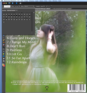
Once again I change the brush to 50 and kept the same pixel size so it is small ribbon.


Once again I change the brush to 50 and kept the same pixel size so it is small ribbon.
 |
| Here I have added the gold ribbon to the fuzzball and the bright. |

I really like the way it is put together but I feel that I should add more the fuzzballs and the ribbon light flowing through.
 |
| Here I have added MORE!!! |
 |
Here I have obtained the sparkling fairytale light that I wanted to make I really really really do like it. After, I was worried that I might had to get rid of the concept,m but using my creativity I managed to come up with something!!! I'M SUPER HAPPY WITH IT!!!
|
Subscribe to:
Posts (Atom)