How I created the magical effect in the inside panel.
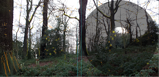
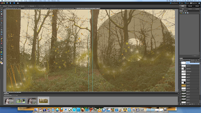
 Here is my original image of the forest. I imported the CD template on to my inside panel. The reason why I done this, is because I wanted the CD to have the same pattern as the inside panel. I wanted the CD to have an exciting visual, which a normal convention in a digipak design. I was inspired by Kate digipak because I really like it and adds to continuity.
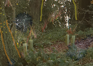
I then used the brush tool to create the effect of having glowing light ion the trees. The function of this is that I wanted to show that her light and music has become an inspiration to nature to take it on the natural form. Also, I wanted it to contrast the idea that nature is peaceful because electropop music is based on having fast upbeat music
I chose to use brush tool 3 just so it acts a fine outline over the branches to create an effect that it has magical and delicately been placed on top of the branches all to do with her music presence.
As you can see what I decided to do was do was to add more yellow paint to outline the trees. I also decided to add a hint of orange to relate back to the light effect image at the front panel of the digipak. The reason for this that I want a hint of continuity running throughout the panels. Furthermore, I changed the brush tool to a spray tool of orange and yellow to go on the bushes and after orange and yellow dots. So it can create a magical feel to the music video. An to show that the light has created a vibrant splash of disturbance to the natural disturbance. More importantly, it goes back to my concept of her being an up and coming singer and her music getting it out to the audience. Melanie Symmonds music video is set in the forest is around greenry, forest and parks. Therfore the light is on Journey (relating it back to the digipak title) and is travelling to the trees so it can get to the city or to her target audience.
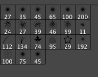 I decided that a want the light to weave in and out of the tress. So changed the brush tool to number 134 to create a grass effect. I then clicked on the tab filter gallery to change the colour effect of the grass. I choose to use an neon yellow to add to the colour effect to demonstrate a light weaving through the trees.
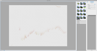
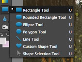
To create the goldie - orange misty effect. It was quite simple to do. First, I had to select the shape tool. I
 then clicked on rectangle shape, so I can include the whole of the inside panel. I then clicked on the fill tool and used the pippet to get the same shade of font colour used on Journey.
I then changed the opacity of the shape fill. Changing the opacity allowed me to fade the colour so it didn't dominate the entire image and we still get to see the forest imagery. I settled at 45%

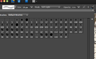 To create the same fuzzball effect shown on the front cover I used the same paint brush tool and dotted the fuzzball to make it follow the goldie - orange light.
 There we have it, how I created the a "glowy", magical forest just by using the tools offered on Photoshop (I enjoyed making the inside panel even though I had several doubts whether it was going to work or not it came out great after I finished it. I am really proud on how it came out).


No comments:
Post a Comment