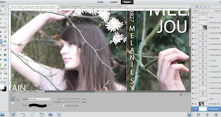
Firstly I used to quick selection tool in order to outline the artist, I selected inverse and then clicked the filters tab, went to blur and selected "Gaussian Blur".
Secondly I set the radius to 4.6% in which tied in really well with the front image as well as enhancing the visuality of the track listing.
After I set the radius this is the end result that I got both accompanied with the track listing, brush tool for the flower imagery and clone tool to remove the fence.
After I had created the blur, there was a clear distinction between the artist and the background as the artist appeared to be more in focus. However I noticed their were some rough patches around the edges. Therefore I also used the blur tool, using a brush in order to refine edges to create a high quality image.


No comments:
Post a Comment