Here are the Do's and Don'ts
Do's
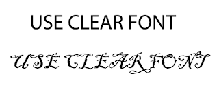
- Use Clear Font
- Use appropriate sizes for
1.images
2.Font
- Use clear photos that are in focus
- Use photos that follows the rule of thirds for compostition
- Use an appropriate type face that follows:
1. Genre conventions
2. A housestyle
- Be careful where you place the font. It must:
2. be clear froma distance
- Follow the conventions of the 3 colour rule and use colour that is appropriate for
2. Font
3. Background
- Use appropriate industry logos and conventions, properly
Barcode
Date
Copyright
Titles
Artist Name
Don'ts
Stretch image, this will make them out of focus
Use layer styles
Use unnecessary effects. It must be revelant to the genre
Place gtext across the artist face

No comments:
Post a Comment