In lesson we had trial run of using photoshop. I manage to familiarise with the main features that will be most useful for the digipak design and for the magazine advert.
 |
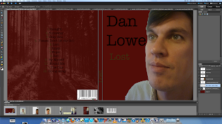
| Here is the magazine advert. The colours that I went for was a simple font and the colour black so it can stand out. I only stuck with 2 colours, I didn't want to go over the top and add colours that are not relevant. I went for the brown-Green colour because I wanted to pick out a colour from his top. I got the ink tool to find the colour on his top and then used it for the title of the album, so it can show there is a relationship between the artist and the album. I used a bugardy red background. I then got an image of a shadowy woods from the Internet and inserted it into the new layer of the adobe photoshop. I then changed the transparency/opacity of the image so it will lightly show through the burgedy red background. |
 |
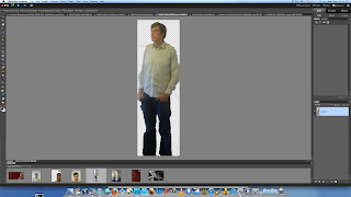
| Croping images. We were given 5 images to play around with and waht picture we wanted to use for the front and/or back panel. |
 |
| The tool I used the polygon lasso tool where I cropped the background around Dan. Once I done that I pressed delete on the keyboard, which got rid of the back ground. |
 |
| Once I cropped out Dan I positioned him in an appropriate postion. Where the text would get in the artist face. I followed most of the conventions. For the background I got the picture from the internet and changed the opacity, similar method to how I the poster.done |
Here is my finished outside panel
(Quite pleased of my first attempt!)


No comments:
Post a Comment